Nextdoor
Getting new neighbours for Nextdoor
In the four years since its launch, local social network Nextdoor had grown to 80,000 active Neighborhoods across the US and was expanding to Europe in 2016.
We were asked to deliver a new visual design and to help users to create a regular habit that approached a daily use of Nextdoor.
I worked as Lead Experience Designer, alongside a wider team.
For R/GA
Lead Experience Designer - Simon Coxon
Visual Design – Ben Minton
Strategy – Lachlan Williams
Creative Direction – Daniel Nieuwenhuizen
Executive Creative Direction – Lucio Rufo
Project Manager – Ed Ross
A text driven service, lacking emotional hooks
The existing service was very functional and lacking in emotional hooks and connections between users. Visually, it was very text driven, with little imagery. Inputs throughout the service were weak, which led to weak outputs.

Nextdoor as it was. Something of a hybrid between LinkedIn and Facebook.
With the client being advocates of Nir Eyal’s ‘Hook model’ of engagement, Behaviour change models, used by Eyal and others, developed by BJ Fogg, would form a strong part of our Experience strategy.

By applying these to a firm understanding of community models we looked at ways of increasing activity and most importantly, re-engagement.
A week of workshops in San Francisco
Following a week of planning activities, we ran four days of workshops in San Francisco as part of requirements gathering and discovery. I led sessions involving experience mapping using their existing personas, feature prioritisation and group sketching.


In addition to the workshops, we held insights and data gathering sessions with researchers, data analysts and team leaders within the business. These helped us construct a wide picture of the issues faced by users within their existing experience.
I ran guerrilla testing sessions of the existing service to understand issues and frustrations with the onboarding process

Mapping the experience
Using a set of existing personas, I used the Fogg Behavioural Model to create an Experience Map, detailing the Motivation, Ability to complete a task and the Triggers within the service. These highlighted pain points and problems, to help us create opportunities and gains for each persona.


To provide a cohesive experience, I ensured the journeys and flows were properly mapped out. These reflected our ethos of making using Nextdoor, simple and habitual - like checking your street to see what was going on outside.

To increase volume of posts I created simplified and richer means of posting - but also key to volume would be widening the number neighbourhoods the user could post to, for a greater response and interactions from the published post.
The scale of the ‘neighbourhood’ would be controlled by the user, to reflect their sense of their environment.

Making Posting flows easier and meaningful
I simplified the act of posting to encourage more activity, but to also improve the quality of content. Posting was customised for each journey type, to make each moment unique, but also to match mental models that were attached to existing competitor services, as well as real world interactions.

Surfacing connections with Cover cards
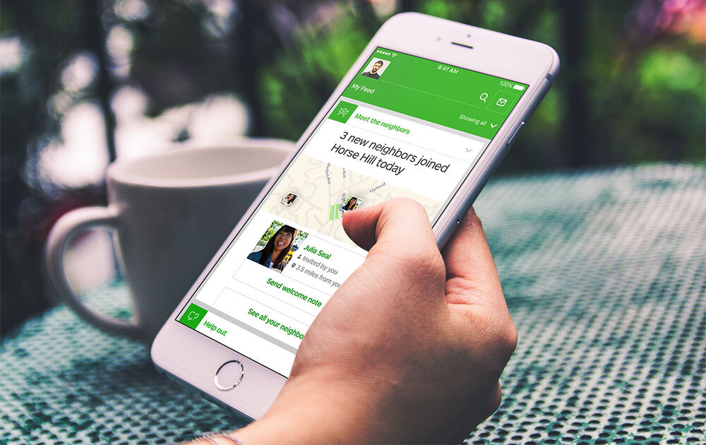
For the final framework, I concepted ‘Cover cards’ to highlight and surface moments in the service, provide feedback and to promote action and engagement. These pulled new, fresh pieces of content to the top of each flow and gave information and opportunities to respond, increasing conversation.

We surfaced the activity and the relationships between entities. The neighbourhood would be a place to find useful information about the things that matter, increasing the sense of belonging and playing a role in building the local community.
These were another moment where we could amplify the human, emotional contact.

Key take-aways
Positives
We delivered a huge amount of high quality work in a very short space of time. This meant the learning curve on the product was steep, but we were action oriented.
Our collaborative process meant we were able to get valuable insights and also give the client a very positive experience. They had previous bad experience of working with agencies. They felt we were able to capture the user and business problems and provide a high quality solution.
Negatives
We didn’t get direct access to a breadth of users to test our ideas with. Most of our information was second hand.
Definition and design consistently overlapped. It wasn’t easy keeping up to speed with what each other was working on and making adjustments. This was the nature of working on a very short time scale (6 weeks) and at an agency.
Clients weren’t aligned on their own needs or wants for their product. A lot of time was wasted with back and forth between time zones (San Francisco, London), as we tried to establish a clear brief. This ate up a lot of time throughout the project. We did however learn new alignment techniques that have proved useful again and again.

